The ALARM Project is excited to announce the release of redist 3.0 on CRAN. This release brings with it new algorithms and major new workflow improvements, making redistricting analysis broadly accessible to data scientists everywhere.

Install the new version with install.packages("redist").
New Features
This release includes far too many changes to list comprehensively. Key improvements and new features include:
- New tidy interface, including new
redist_mapandredist_plansobjects - Merge-split MCMC now available in
redist_mergesplit() - Short burst MCMC optimization now available in
redist_shortburst()along with scoring functions - Improved Flip MCMC interface and performance improvements
- New support for larger simulation size limits
- Functions to freeze parts of a map and extract district cores
- New VRA constraint
- Many new plotting functions
- Consistent function and argument names
- New partisanship and compactnes metrics
- Performance improvements to compactness calculations
- Plan comparison and classification in
compare_plans()andclassify_plans() - New
iowadataset and cleaned-up package data
To begin exploring the new features, check out the new Get Started vignette.
Workflow Example: North Carolina
To demonstrate the new redist workflow, we’ll run through a basic analysis of the 2017 congressional districts of the state of North Carolina, which were struck down as an unconstitutional partisan gerrymander in 2019.
New workflow
Under the new workflow, a redistricting analysis begins with a redist_map object, which defines the basic parameters of the redistricting problem. The redist_map() constructor builds the precinct adjacency graph which is required for redistricting simulation, and stores relevant metadata, such as the desired population parity tolerance and a reference to the existing districts. It also comes with helpful plotting functions.
nc = redist_map(nc_shp, existing_plan=cd_17, pop_tol=0.01)
print(nc)
A redist_map object with 2692 units and 15 fields
To be partitioned into 13 districts with population between 733,499 - 1.0% and 733,499 + 1.0%
With geometry:
    bbox:           xmin: 406820 ymin: 2696.2 xmax: 3070200 ymax: 1043600
    projected CRS:  NAD83(HARN) / North Carolina (ftUS)
# A tibble: 2,692 x 15
   vtd       county   pop   vap el14g_uss_r el14g_uss_d el14g_uss_l
 * <chr>     <chr>  <int> <int>       <int>       <int>       <int>
 1 3700106W  37001   1973  1505         181         182          17
 2 3700112E  37001   3391  2503         180         271          21
 3 3700112W  37001   2744  2156         457         481          42
 4 3700106N  37001   4468  3167         231         466          31
 5 37001126  37001   2038  1713         670         416          38
 6 37001124  37001   2455  1948         491         391          33
 7 370011210 37001   2802  2127         358         309          31
 8 3700103N  37001   5712  4955        1063         853          53
 9 3700102   37001   4491  3483        1246         313          62
10 3700106E  37001   3113  2371         423         432          42
# … with 2,682 more rows, and 8 more variables: el14g_uss_wi <int>,
#   el14g_uss_tot <int>, cd_13 <int>, cd_17 <int>, aland10 <dbl>,
#   awater10 <dbl>, geometry <MULTIPOLYGON [US_survey_foot]>,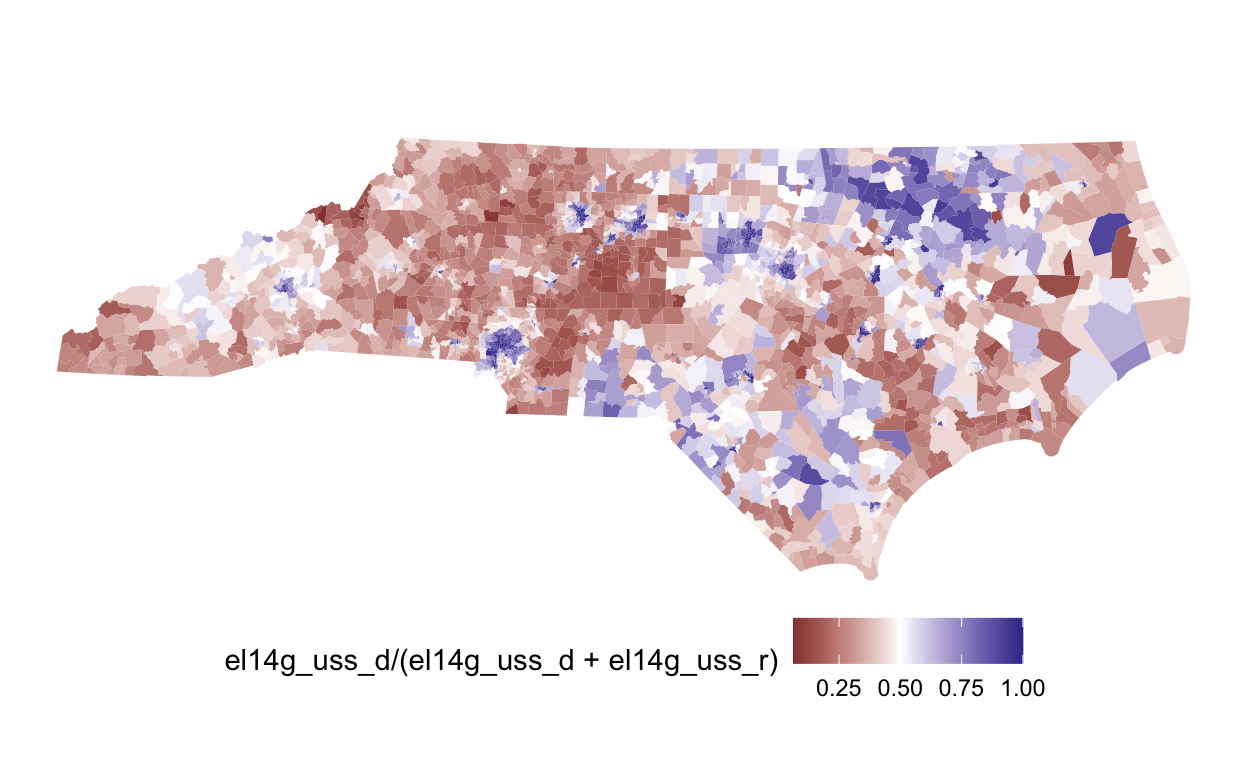
# adj <list>plot(nc, el14g_uss_d/(el14g_uss_d+el14g_uss_r)) +
scale_fill_gradient2(midpoint=0.5)
Once we’ve created a redist_map object, we can simulate redistricting plans.
plans = redist_smc(nc, 1000, counties=county, silent=TRUE) # 1000 plans
print(plans)
1000 sampled plans and 1 reference plan with 13 districts from a 2692-unit map,
  drawn using Sequential Monte Carlo
With plans resampled from weights
Plans matrix: num [1:2692, 1:1001] 6 6 6 6 6 6 6 6 6 6 ...
# A tibble: 13,013 x 3
   draw  district total_pop
   <fct>    <int>     <dbl>
 1 cd_17        1    733323
 2 cd_17        2    734740
 3 cd_17        3    732627
 4 cd_17        4    733218
 5 cd_17        5    733879
 6 cd_17        6    733554
 7 cd_17        7    734750
 8 cd_17        8    734777
 9 cd_17        9    731507
10 cd_17       10    736057
# … with 13,003 more rows
The plans variable is a redist_plans object—a special container designed to make handling sets of redistricting plans painless. As the output above shows, plans contains the 1,000 samppled plans, plus the 2017 congressional districts. We can plot a few of these plans.
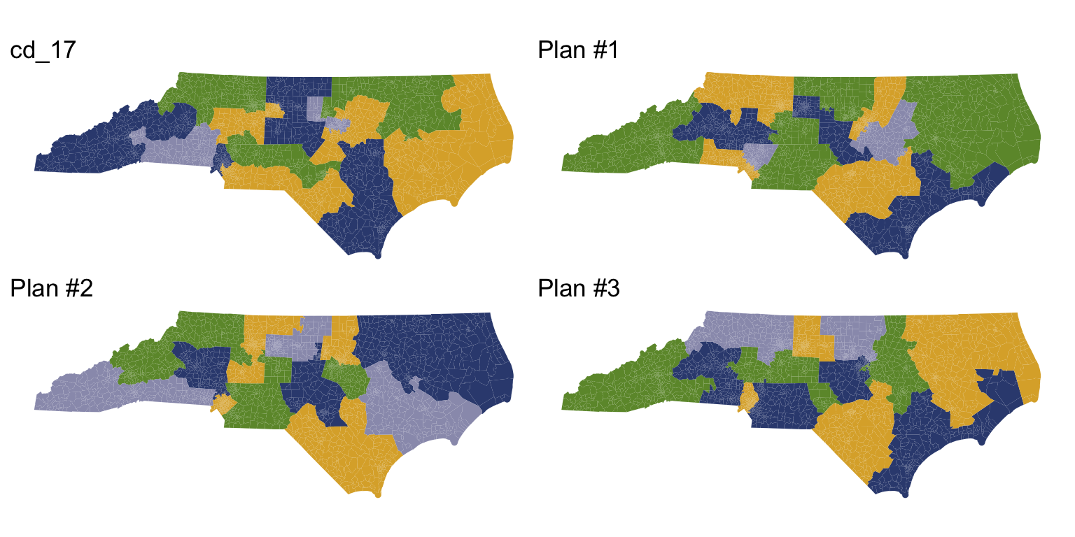
redist.plot.plans(plans, draws=c("cd_17", "1", "2", "3"), geom=nc)
A redist_plans object makes it easy to compute plan and district summary statistics.
plans = plans %>%
    mutate(comp = distr_compactness(nc),
           dem_share = group_frac(nc, el14g_uss_d, el14g_uss_d + el14g_uss_r))
print(plans)
1000 sampled plans and 1 reference plan with 13 districts from a 2692-unit map,
drawn using Sequential Monte Carlo
With plans resampled from weights
Plans matrix: num [1:2692, 1:1001] 6 6 6 6 6 6 6 6 6 6 ...
# A tibble: 13,013 x 5
draw district total_pop comp dem_share
<fct> <int> <dbl> <dbl> <dbl>
1 cd_17 1 733323 0.803 0.687
2 cd_17 2 734740 0.803 0.443
3 cd_17 3 732627 0.803 0.407
4 cd_17 4 733218 0.803 0.674
5 cd_17 5 733879 0.803 0.425
6 cd_17 6 733554 0.803 0.441
7 cd_17 7 734750 0.803 0.446
8 cd_17 8 734777 0.803 0.439
9 cd_17 9 731507 0.803 0.440
10 cd_17 10 736057 0.803 0.419
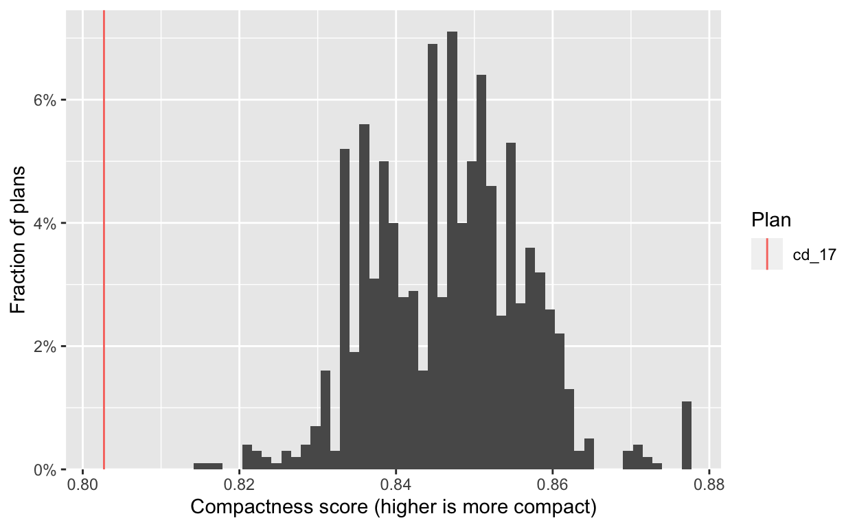
# … with 13,003 more rowsFrom there, we can quickly generate informative plots. First we check the compactness of the generated plans, and see that they are significantly more compact than the adopted 2017 plan.
hist(plans, comp) +
    labs(x="Compactness score (higher is more compact)")
Next, we look at the partisan implications of the 2017 plan. We plot the two-party Democratic vote share in each district, with districts sorted by this quantity. Each dot on the plot below is a district from one simulated plan, and the red lines show the values for the 2017 plan.
redist.plot.distr_qtys(plans, dem_share, size=0.1)
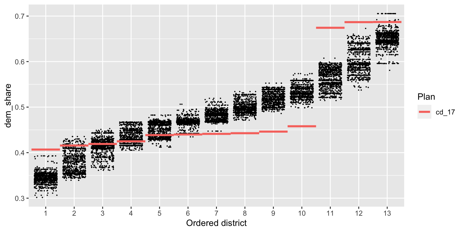
We see immediately that the 2017 plan packs Democratic voters into the three most Democratic districts, and cracks them in the remaining 10 districts, leading to a durable 10–3 Republican-Democratic seat split (in an election which Democrats captured 49% of the statewide two-party vote). A clear partisan gerrymander.
Studying districts 1, 2, and 4
If we want to study a specific set of districts, we can quickly filter() to the relevant map area and re-run the analysis. The redist_map() object will handle all appropriate adjustments to the adjacency graph, number of districts, and population tolerance (as is visible below).
A redist_map object with 571 units and 15 fields
To be partitioned into 3 districts with population between 733,760 - 1.0353% and 733,760 + 0.96399%
With geometry:
    bbox:           xmin: 1921600 ymin: 524880 xmax: 2784100 ymax: 1028200
    projected CRS:  NAD83(HARN) / North Carolina (ftUS)
# A tibble: 571 x 15
   vtd     county   pop   vap el14g_uss_r el14g_uss_d el14g_uss_l
 * <chr>   <chr>  <int> <int>       <int>       <int>       <int>
 1 37015C2 37015   2182  1707         174         503          13
 2 37015M1 37015   1103   849         172         167           5
 3 37015C1 37015   1229   986         229         184          11
 4 37015MH 37015    992   811         146         254          12
 5 37015W2 37015    966   764         286          47          20
 6 37015W1 37015   7005  5703         596        1190          44
 7 37015M2 37015   1290   983          99         239          16
 8 37015SN 37015   1410  1025          63         327          11
 9 37015WH 37015   1554  1274         292         262          12
10 37015WD 37015   1409  1050          35         319           5
# … with 561 more rows, and 8 more variables: el14g_uss_wi <int>,
#   el14g_uss_tot <int>, cd_13 <int>, cd_17 <int>, aland10 <dbl>,
#   awater10 <dbl>, geometry <MULTIPOLYGON [US_survey_foot]>,
# adj <list>plot(nc_sub)
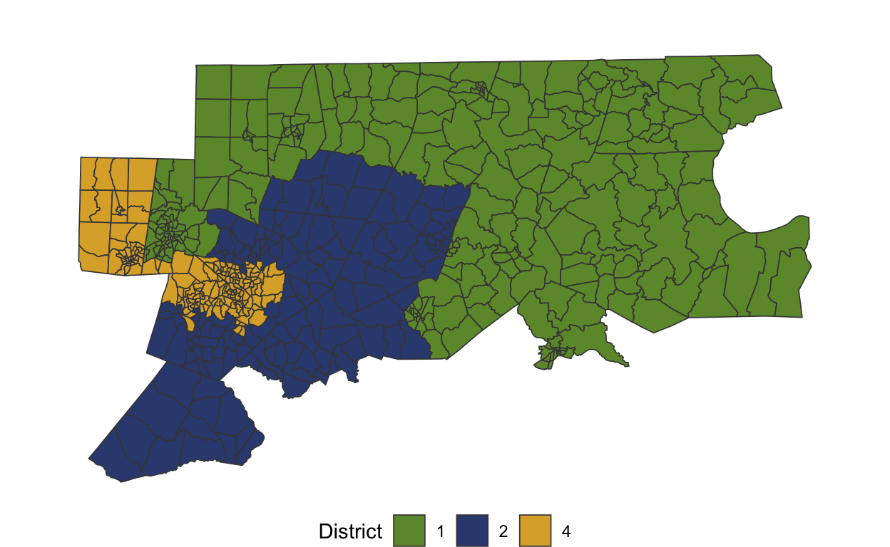
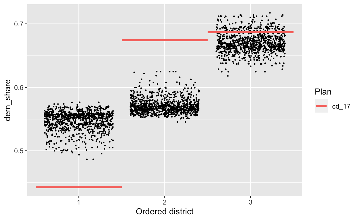
On this subset, too, the adopted 2017 plan is a significant outlier.
plans_sub = redist_smc(nc_sub, 1000, counties=county, silent=T) %>%
    mutate(dem_share = group_frac(nc_sub, el14g_uss_d, el14g_uss_d + el14g_uss_r))
redist.plot.distr_qtys(plans_sub, dem_share, size=0.3)
Old workflow
In comparison, the old workflow required significantly more steps and manual processing.
Once we’ve downloaded the data, we can start by building the adjacency graph.
adj <- redist.adjacency(nc_shp)
Time to first simulation was never really the issue, however each simulation required many inputs. redist_map objects keep track of the adj, total_pop, ndists, and pop_tol arguments, but in the older version, you had to specify each of these for every simulation. One of the quirky aspects of the older version was that counties needed to be a vector with values 1:n_counties, meaning that you had to manually transform it to use it and that only worked if the counties were contiguous.
sims <- redist.smc(adj = adj, total_pop = nc_shp$pop, ndists = 13,
                   pop_tol = 0.01,
                   counties = match(nc_shp$county, unique(nc_shp$county)),
                   nsims = 1000, silent = TRUE)
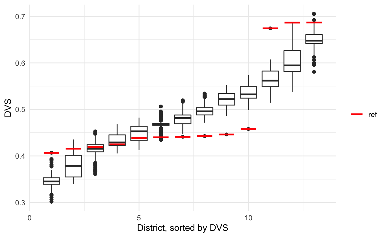
Once you finished simulating, setting up plots was always a hassle, as you needed to plot both the distribution of simulations and then compute the same metric separately for the reference plan, in this case that’s the 2017 congressional districts.
metrics <- redist.metrics(plans = sims$plans, measure = 'DVS',
                          rvote = nc_shp$el14g_uss_r, nc_shp$el14g_uss_d)

sorted <- metrics %>%
  group_by(draw) %>%
  arrange(DVS,.by_group = TRUE) %>%
  mutate(district = 1:13) %>%
  ungroup()

reference_metrics <- redist.metrics(plans = nc_shp$cd_17,
                                    measure = 'DVS',
                                    rvote = nc_shp$el14g_uss_r,
                                    dvote = nc_shp$el14g_uss_d)

sorted_reference <- reference_metrics %>%
    arrange(DVS) %>%
    mutate(district = 1:13)
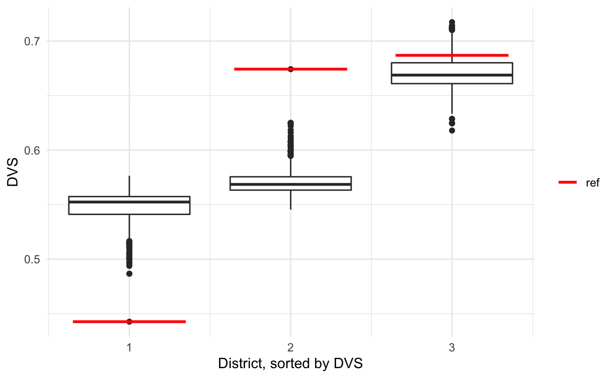
And then to plot the standard stacked boxplots, you would need to add the reference plan manually to the rest.
sorted %>% ggplot(aes(x = district, y = DVS, group = district)) +
  geom_boxplot() +
  theme_minimal() +
  labs(x = 'District, sorted by DVS') +
  geom_segment(data = sorted_reference, size = 1,
               aes(x = district - 0.35, xend = district + 0.35,
                   yend = DVS, color = 'red')) +
  scale_color_manual(name = '', values = c('red' = 'red'),
  labels = c('ref'), guide = 'legend')
Studying districts 1, 2, and 4
The steps between loading in data to your first simulation wasn’t terrible in the old version when you were working with the full map. However, when trying to work with subsets, it became messy.
First you needed to subset the shape and then rebuild a new adjacency graph that only had the remaining precincts.
sub <- nc_shp %>% filter(cd_17 %in% c(1, 2, 4))
sub_adj <- redist.adjacency(sub)
Then, if your target on the full map was 1%, you had to compute the equivalent on the subset map, as a 1% population deviation on a subset is often larger once recombined with the full map.
pop_tol <- 0.01
subparpop <- sum(sub$pop)/3
parpop <- sum(nc_shp$pop)/13

sub_pop_tol <-  min(abs(subparpop - parpop * (1 - pop_tol)),
                abs(subparpop - parpop * (1 + pop_tol))) / subparpop
sub_pop_tol
[1] 0.0096399Now we can simulate again, but on the smaller map.
sims_sub <- redist.smc(adj = sub_adj, total_pop = sub$pop,
                      nsims = 1000,  ndists = 3,
                      counties = match(sub$county, unique(sub$county)),
                      pop_tol = sub_pop_tol, silent = TRUE)
As before, we have to compute metrics for both the reference plan and the simulated plans.
sub_metrics <- redist.metrics(plans = sims_sub$plans, measure = 'DVS',
                              rvote = sub$el14g_uss_r, sub$el14g_uss_d)

sub_sorted <- sub_metrics %>%
  group_by(draw) %>%
  arrange(DVS,.by_group = TRUE) %>%
  mutate(district = 1:3) %>%
  ungroup()

sub_reference_metrics <- redist.metrics(plans = match(sub$cd_17,
                                                      unique(sub$cd_17)),
                                        measure = 'DVS',
                                        rvote = sub$el14g_uss_r,
                                        dvote = sub$el14g_uss_d)

sub_sorted_reference <- sub_reference_metrics %>%
    arrange(DVS) %>%
    mutate(district = 1:3)
And finally, we can plot the metrics and manually add the reference points.
sub_sorted %>% ggplot(aes(x = district, y = DVS, group = district)) +
  geom_boxplot() +
  theme_minimal() +
  labs(x = 'District, sorted by DVS') +
  geom_segment(data = sub_sorted_reference, size = 1,
               aes(x = district - 0.35, xend = district + 0.35,
                   yend = DVS, color = 'red')) +
  scale_color_manual(name = '', values = c('red' = 'red'),
  labels = c('ref'), guide = 'legend')